Showing posts with label Design. Show all posts

Monday, 21 September 2009

Vince Frost

Frost is a British graphic designer based in Australia and the UK. He has won a number of awards including a gold D&AD. He is famous for working with large clients and his creativity and originality is an inspiration.

In an interview with Computer Arts magazine (click here), Frost states “Nike and Apple are design companies. In terms of identity we all have a brand, a unique point of difference.” When you look at the work of Vince Frost it can be said that it has an essence of his client and Frost himself.

This was a piece he designed for the Sydney Dance Company, which cleverly merged ‘Sydney’ and ‘Dance’ in type.


Frost is consistent when promoting his own identity. He uses the same type when promoting himself and sometimes plays with words (e.g. one of his shows was titled frost bite*).


Sunday, 20 September 2009

Viral email text effects

Designers have to constantly adapt to changes and innovations in technology, but sometimes designers also have to adapt to limitations in technology.

The creative agency G2 direct & Digital recently won an award for a safe sex campaign. The campaign was conducted through email. The only problem with this medium was that a lot of email programs did not accept HTML (although this is becoming a minority). As a result the agency designed a piece that could be viewed with a clever text effect (see below).


See the email for yourself:

-Men interested in women click here.

-Women interested in men click here.

-Men interested in men click here.

What I found interesting about this campaign was its ability to use a media within its limitations and still create an element of surprise.

Thursday, 17 September 2009

The Tube Map

There is no doubt that the tube map is a design classic. This week it was redesigned (partly) and the river Thames was omitted from the design to huge public and political outcry. The river-less map can be found here.

When the map was initially designed, Harry Beck removed all superfluous information including geography. The 1908 map (at the bottom of the post) was the first tube map and took geography into consideration. Beck designed the first diagrammatic map in 1931, it was said to be inspired by electric circuit diagrams.

Despite lacking nearly all geographical features, the tube map has always maintained London's river. So when TfL (Transport for London) decided to omit the river there was a backlash. Note the following articles:

This reminds us that people appreciate clarity and information laid out clearly, however they also have sentimental connections, which is an important thing to note in design.

The 1908 London Underground map. The first tube map that took geography into consideration.

Friday, 14 August 2009

Scottish Parliament Buiding

I recently visited the city of Edinburgh. During this visit I took an excursion to the Scottish Parliament building. I was interested in the design of the building, because it was so different from the norm. It is also famous for its ‘eco-friendly’ sustainable architectural approach.

When the building opened first, it received a mixture of responses about the design. The building is probably the most abstract design of a parliament building in the world, with inspiration being taken from many sources including historic paintings.

When I viewed this building it made me think back to my previous post about the Brutalist movement (click here to view) and questioning what is right and wrong in design. Good design evokes a response, and this building certainly does that. Critically another view may-be that good design is democratic, a possible topic to debate.

Thursday, 13 August 2009

The Wellcome Collection


I received this flyer whilst out and about in London. I kept hold of it because I liked the use of old type and illustration for medicine. I decided to visit the exhibition (an example of effective advertising). Although the exhibition did not delve into the dynamics of typography in medicine, it did show the importance of design for medicine in the past.

The current exhibition displays anatomical wax works from the 19th century, which were of great interest to people at the time, and a necessary part of medicine.

Although some of the exhibition was somewhat gruesome (even for today’s standards), it was informative about how science and design were combined to educate.

This is an early-twentiuth century poster from the exhibition educating Spaniards about tuberculosis. It would be interesting to compare this to a modern day swine flu poster. (Collection Family Coolen, Antwerp/Museum Dr Guislain, Ghent, Belgium)

Find out more by visiting the Wellcome Collection website here.

Monday, 10 August 2009

Colgate - Don't Forget!

Here is another extremely effective and clever use of ambient media. Every year Colgate holds events for ‘Oral Health Month’ and hands out free samples. This year instead of handing out free samples of toothpaste and brushes it decided to hand out chocolate ice cream and sweets. Why? You may ask. Well after you finish eating the confectionary a message reminding you not to forget to brush your teeth is revealed.


This message instantly resonates in the mind of the person reminding them of why they brush their teeth. It reminds us that in design it is always the simple messages that are the most effective.

This particular campaign was conducted by the creative agency Y&R in Thailand.

Thursday, 6 August 2009

Ambient Advertising – Yellow Pages

In a world where you are bombarded daily with visual stimuli, it has become an increasingly difficult task for advertisers to get their message out to the public. One effective way to make your message stand out from the rest is the use of ambient media.


This particular campaign by Yellow Pages in Canada caught my eye. It was conducted by the agency Cossette Media and was very successful for Yellow Pages; with website hits up 18% and retailers contacting Yellow Pages requesting darts.

It is not the first time ambient media has been used, however I found it fascinating how they effectively merged a concept of pinpointing something on the internet and visually represented it in a non-virtual way.

Monday, 27 July 2009

The Design Police

In a world with some good design and an abundance of bad design, the 'Design Police' have come up with an ingenious campaign to rid the world of bad design.
Paying close attention to typography and basic graphic design principles the Design Police is a good example of a guerilla campaign. This may make crit sessions faster and you can print out your own copies from design-police.org.

Friday, 24 July 2009

Orange, Digital Craft

Something you may have come across recently:

'Bright Top Ups' an advert put together by the agency Fallon and Peepshow for Orange


The advert consisted of characters designed by Peepshow and devised by Fallon. What is interesting about this particular project is its combination of media. Card models were created and used as props and then edited using 3D software to give it the appearance of puppets.

The combining of craft with digital does appear to be a trend in the industry at the moment. Although much can be achieved with changing technologies, it seems that the texture and aesthetics of the real deal sometimes cannot be beat.

Wednesday, 22 July 2009

Illinois Institute of Technology


I took these photographs at the Illinois Institute of Technology in Chicago. This particular building was designed by the architect Remmert Koolhaas. I was particularly interested in the use of texture and colour within the building. The intensity of light and colour was a key aspect in the design. The use of type, texture and pictograms were all incorporated providing a unique and consistent atmosphere to the building.

Tuesday, 21 July 2009

Chicago - A unique place for architecture and design


I recently visited the Mid-West American city which is rich with architecture, art and design. My trip consisted of visiting a number of buildings that were integral with regards to modern American architecture, and visiting noted sites in the city.

Chicago is a city that has flourished in recent history and was the first city of the skyscraper (not New York, as many would think). Below is an evaluation of a few observations I made during my trip there:

The Bean:
This sculpture is situated in Millennium Park in Chicago. It has been nicknamed 'the bean' by residents, but it is actually titled 'Cloud Gate', and is by Anglo-Indian artist Anish Kapoor. Its design is subtle in comparison to the rest of the Chicago skyline. It delicately mirrors the skyline above and the people below, providing an interactive piece to the people that surround it. It acts like a distorted mirror to those below and arround it.

As a design piece, the artist has put great consideration into how this sculpture fits into its environment, which I feel is something that applies to all design. It creates numerous responses and reaction to those that view it.

Monday, 20 July 2009

Milwaukee Art Museum

I recently visited the Milwaukee Art Museum in Wisconsin, USA which is noted for its great architecture and its sensational collection of modern art.

The museum building was built by the world renowned architect Santiago Calatrava. Its exterior was an engineering feet with steel wings that fold and unfold frequently. Calatrava's style of architecture is takes form like a sculpture with soft curves and beams; a stark contrast to the brutalist architecture I looked at previously.

The building is not the only interesting part of the museum. It features a wide variety of art and design pieces, more info can be found on their website here.

Whilst I was visiting there was an exhibit about optical illusions and colour, I took a few photos of pieces that I found particularly interesting.

The above photo is of a piece called 'Walk-In Infinity Chamber' by Stanley Landsman. Its title is descriptive of what it is. With padding on my feet I walked into a cube shaped chamber made of glass. The glass contained small lights which were reflected infinitely. The piece was recently refurbished and is one of the most popular exhibits in Milwaukee Art Museum.

I found the Milwaukee Art Museum to be symbolic of the American Mid-West. It is an example of where contemporary meets the traditional, but it also has an essence of liberalism which isn't evident everywhere in the U.S. It is difficult to be critical of somewhere which conveys so much. The museum probably does not compete to the levels of the Tate Modern or MoMA, but it does spark interest and is very insightful with a wide variety of pieces.

Friday, 17 July 2009

Interactive Innovation

Graphic design is part of everyday life and is continually changing in form. The most recent and significant development is obviously the internet and the advent of interactive design.

I have found it hugely interesting how firms are continually adapting to innovations in technology and how they achieve new reactions out of design.

Clusta Ltd is an agency based in Birmingham which specialises in combining graphic and communication design with innovations in digital technology.

The company worked on a project for the American agency Hall Riney. They created a site which combined and utilised video, flash and playing with water and ink.

Screenshot of interactive navigation using a webcam to direct the ink to a link.

The Hal Riney site based its concept to symbolise 'new blood' in the company, and was created by filming ink in a fish tank and compiling it together in After Effects. The website is a good example of combining a design concept with innovations in technology.

Monday, 6 July 2009

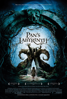
El laberinto del fauno

a.k.a. 'Pan's Labyrinth' is a dark fairy-tale that deals with very harrowing issues.

I watched this film for the first time this week and made note of its evocative cinematography and its original mix of combining child-like fantasy with adult issues.


The film is set in Spain under Franco's dictatorship and follows a young girl (Ofelia) who is interested in books and fairy-tales.

There appears to be two plots in the film. One being the war time reality, and the other being a fantasy. This fantasy seems to be a metaphor of both being human and of the feelings of the oppressed Spanish people at the time.

In regards to the cinematography; the lighting, the camera movement and the special effects all contribute to making this film an epic piece. The use of fantasy and CGI graphics are intriguing. The use of violence contrasted with a child's imagination evokes many emotions.

The technical details about the making of the film can be found on IMDB here.

The website of the film is also a great resource, and has an interesting and award winning design which can be found here.


Monday, 29 June 2009

Brutalist Beauty

It is not often that you come across a building that was designed to have an imposing appearance that questions beauty, however Trellick Tower in West London does just that.

I pass this building often; it is hard to miss with its harsh concrete vertical appearance juxtaposed against the soft pastel low-rise terraces in Notting Hill.
Trellick Tower dominates the West London sky-line.

The building comes under the appropriately named 'brutalist' movement of architecture, and was designed by the architect Erno Goldfinger.

During the 1980's along with many high rises the building suffered a bad reputation for crime. Its discreet corridors and bare concrete walls becoming a place of fear. More recently the building has become a cult icon and appreciated for its unique architecture; appreciated so much that it is now considered a Grade II* listed building. It raises many questions in regards to design and beauty, mainly who is to judge?

The main principle in architecture is that form follows function, and therefore the design should primarily be designed with its purpose in mind. Trellick Tower appears to have no superfluous design. Its function which makes up its form can be appreciated and its appearance giving the viewer different sentiments.

More about the building can be found out here.